IKEA

Beyond

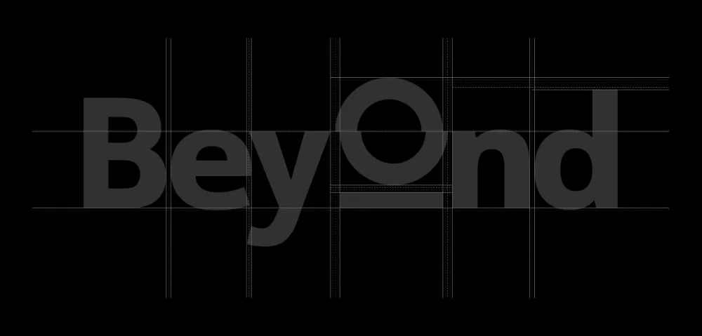
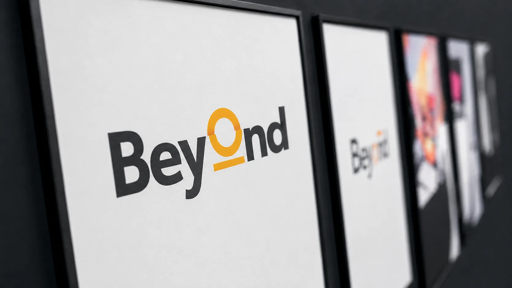
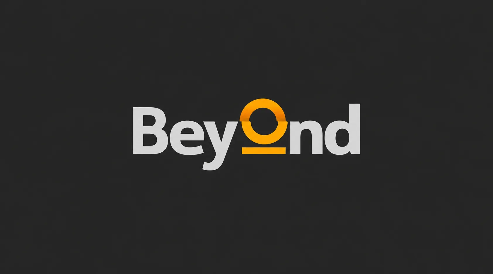
IKEA Beyond wordmark in light grey and orange on a dark grey background.

Beyond was created as the innovation hub of IKEA Retail Poland: a place where ideas from co-workers, external partners and emerging technology could be gathered, tested and developed. I shaped the initiative into a complete brand from the ground up, creating its name, strategic direction, visual identity, manifesto, motion language and communication tools. The result was more than a launch identity. It was a working system that explained Beyond's purpose, invited participation, and kept innovation visible across the organization.

The initiative needed its own clear identity without feeling detached from IKEA. It had to make innovation understandable and inclusive, connect ambitious future thinking with everyday ideas from co-workers, and stay consistent across internal channels, physical spaces, presentations, film, and ongoing communication.

I defined Beyond as a way of seeing and acting, not simply the name of a department. The idea of looking past the ordinary became the thread connecting strategy, language, and design. A direct wordmark, the transforming O, a concise manifesto and a flexible set of tools gave the initiative a distinct voice while remaining rooted in IKEA's human, practical culture.

A name that became an invitation

The name Beyond expressed both direction and behaviour.

It created a language for ideas outside expected limits, while 'Beyond moments' turned the concept into a repeatable format for sharing projects, experiments and progress. This made the brand useful from its first launch message through ongoing internal communication.

Giving innovation a place inside IKEA

Beyond began with a broad question:

How can an internal innovation hub feel open to everyone and still point clearly toward the future? Research into IKEA culture, innovation examples and the meaning of 'beyond' led to a simple position: Future NOW. The brand would celebrate both breakthrough ideas and small acts that improve everyday life.

Beyond means reaching the other or further side of something. It describes what lies outside an established limit, boundary or scope, such as beyond the hills, beyond a jurisdiction or beyond what is already known.

The word originates from Old English.

Making the idea visible

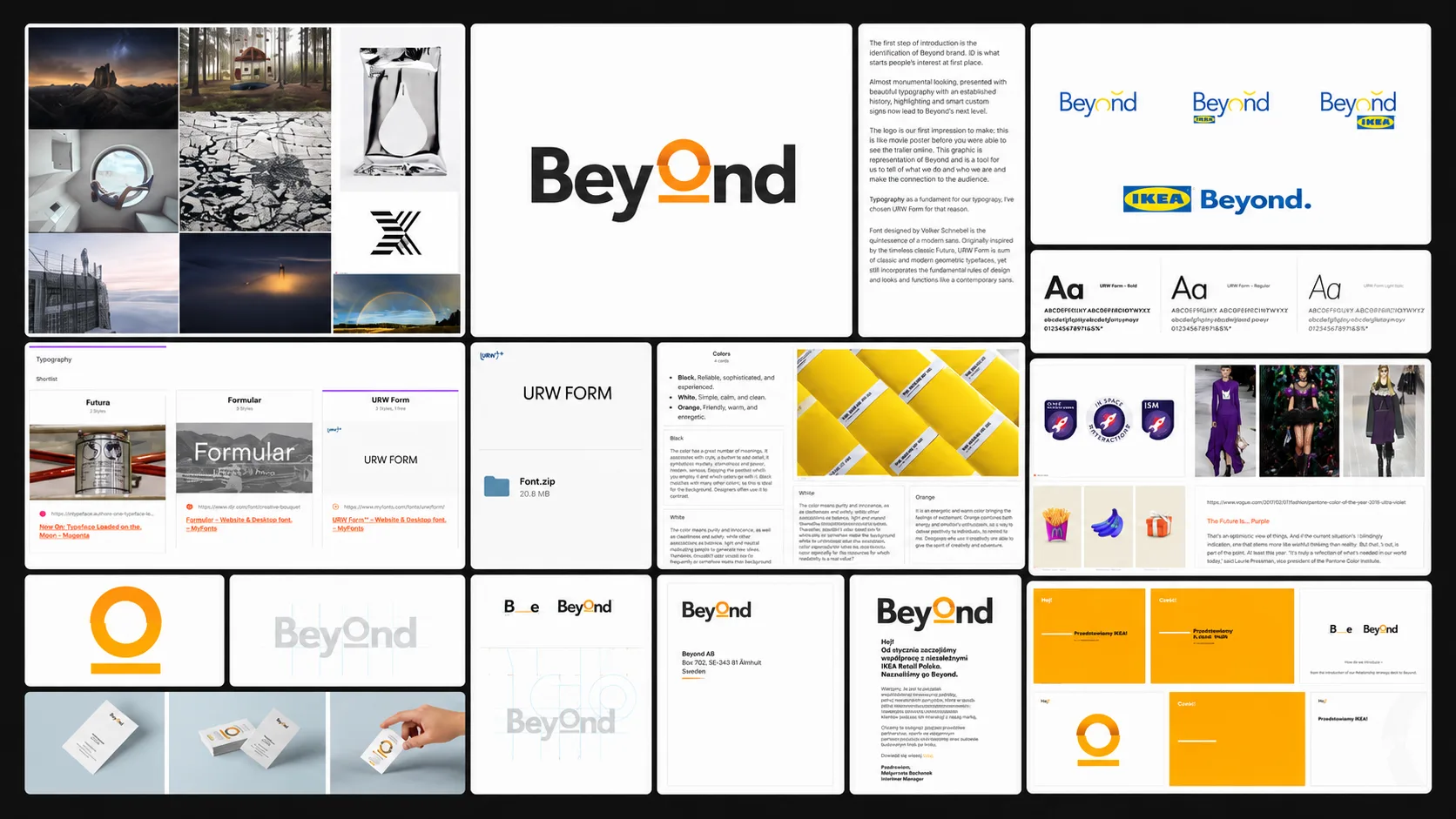
The identity was built around URW Form, a contemporary geometric typeface with roots in Futura.

Black, white and a warm orange created a direct, practical palette. The circular O became the active part of the system: a frame for imagery, a horizon and a motion device capable of revealing what sits beyond the expected.

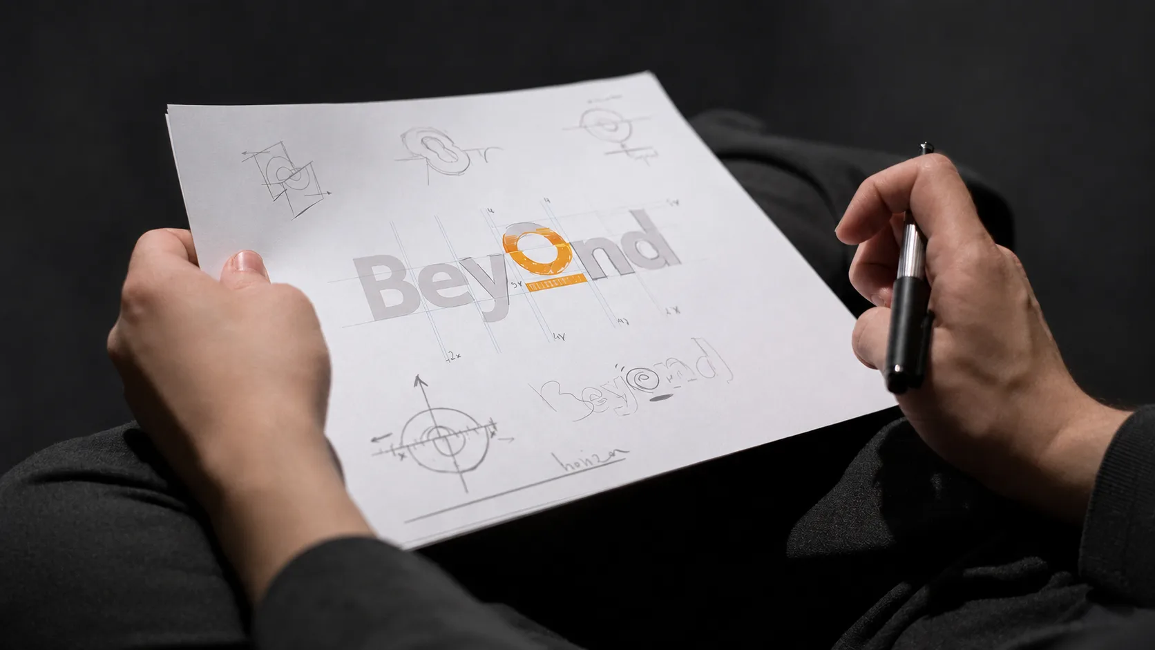
Designer holding a sheet of early IKEA Beyond logo sketches and construction studies.
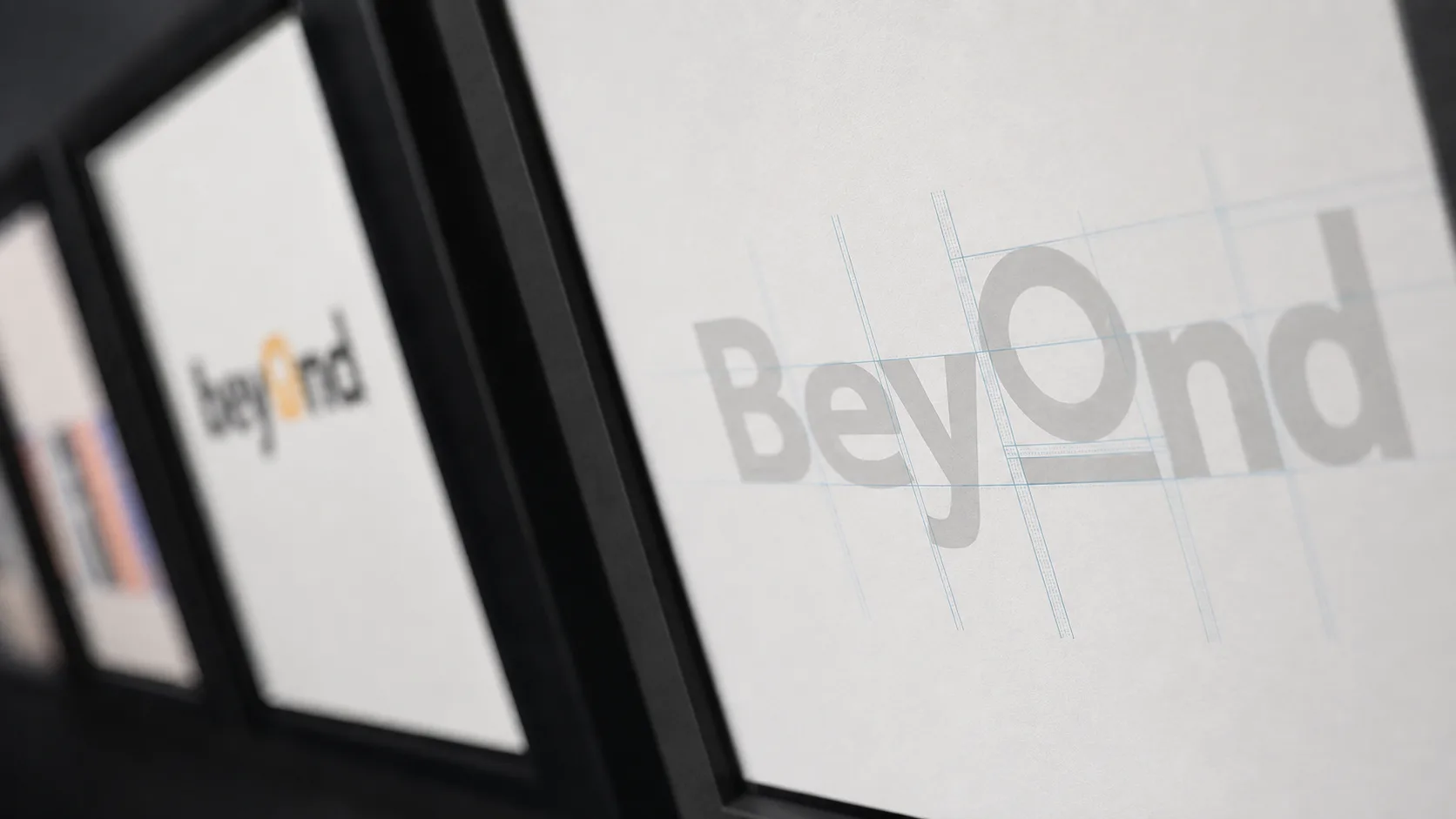
IKEA Beyond logo construction studies displayed on presentation boards.
Final IKEA Beyond wordmark presented among earlier identity explorations.

A voice people could join

To introduce the initiative, I wrote a bilingual manifesto built around the invitation Be Beyond.

The language moved from the familiar world toward the possibility of change and was produced in several narrated versions, including full, pure and short edits. Supporting launch copy translated the same idea into an accessible mailing and a six-part introduction to the hub.

The Manifest

0:000:39

An identity designed to move

Motion extended the idea of crossing expected boundaries.

I explored multiple logo animation routes, developed the final mark animation and created motion assets for communication and Inside. Type could separate, shift and reassemble into the Beyond wordmark, while the transforming O carried the signature of the identity across formats.

From identity to everyday tools

Beyond was designed to work beyond a single launch.

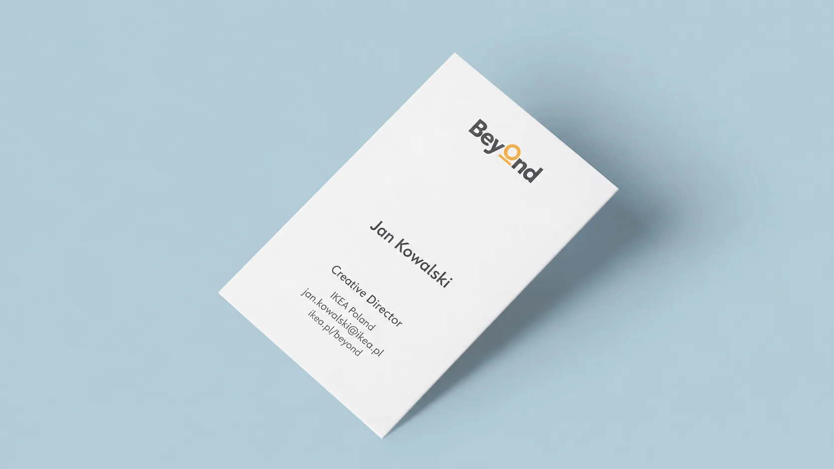
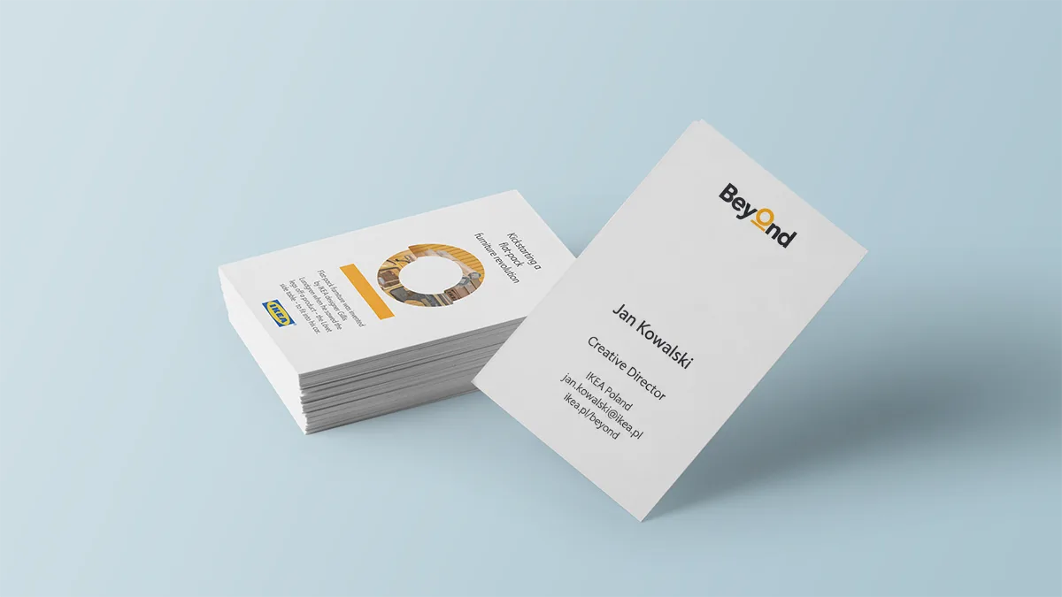
I translated the identity into business cards, animated email formats, Inside graphics, bilingual launch materials and a PowerPoint system whose opening slide could carry the animated mark. Each element helped the team explain projects consistently while keeping the brand recognisable and alive.

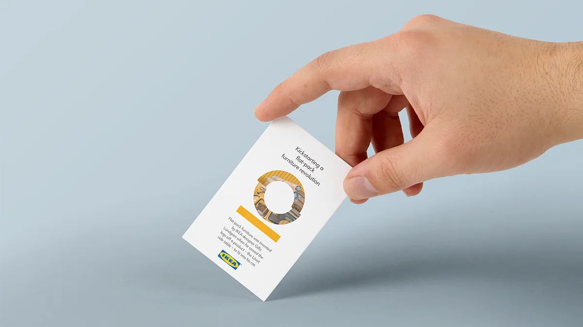
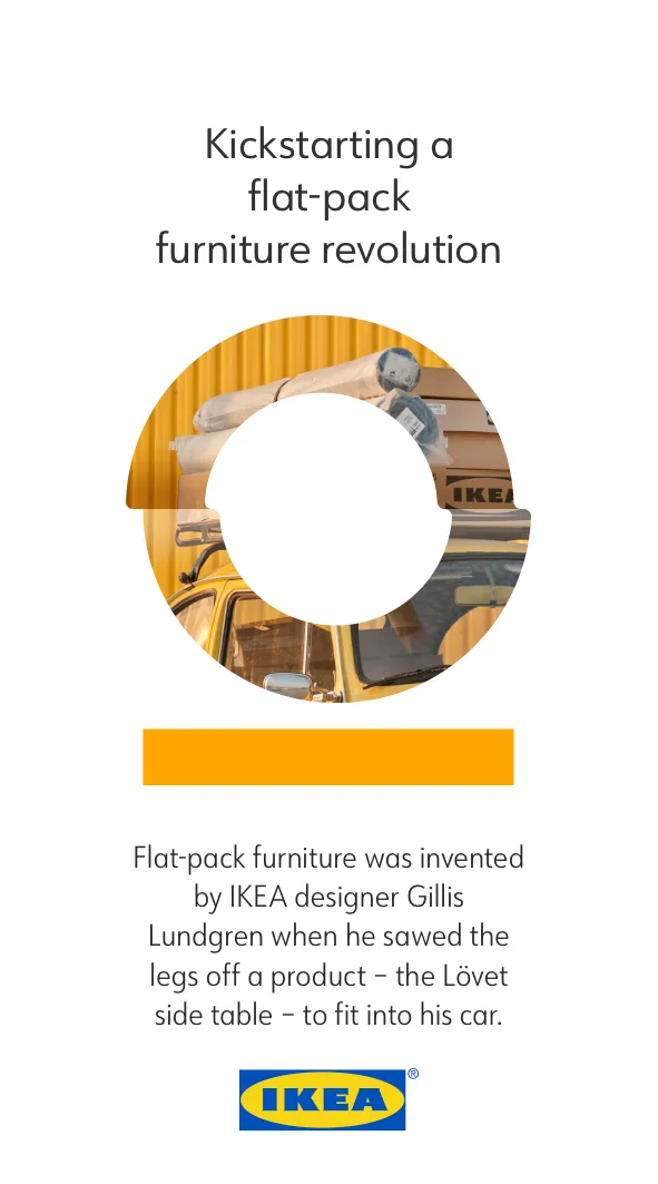
The back of every IKEA Beyond business card featured a different story from IKEA’s history.

These small moments of ingenuity connected the innovation hub with the curiosity, resourcefulness and everyday problem-solving at the heart of IKEA’s DNA.

Each employee received a story selected to reflect their role, making every card personal while keeping it part of the same shared system.

Built to launch and keep working

The communication plan connected the launch with a longer rhythm of internal stories.

Mailing, Yammer, office interventions, weekly project updates and future podcast or event formats were organised across three stages: launch, ongoing communication and growth. The system was conceived to collect ideas as well as communicate them.

A complete platform for innovation

Beyond emerged as a coherent internal brand with its own strategy, identity, voice, motion language and operational toolkit.

The system could introduce the hub, explain its purpose, invite ideas and grow into recurring communication. For me, the project brought together the full range of creative direction with hands-on making, from the first name to the final slide.