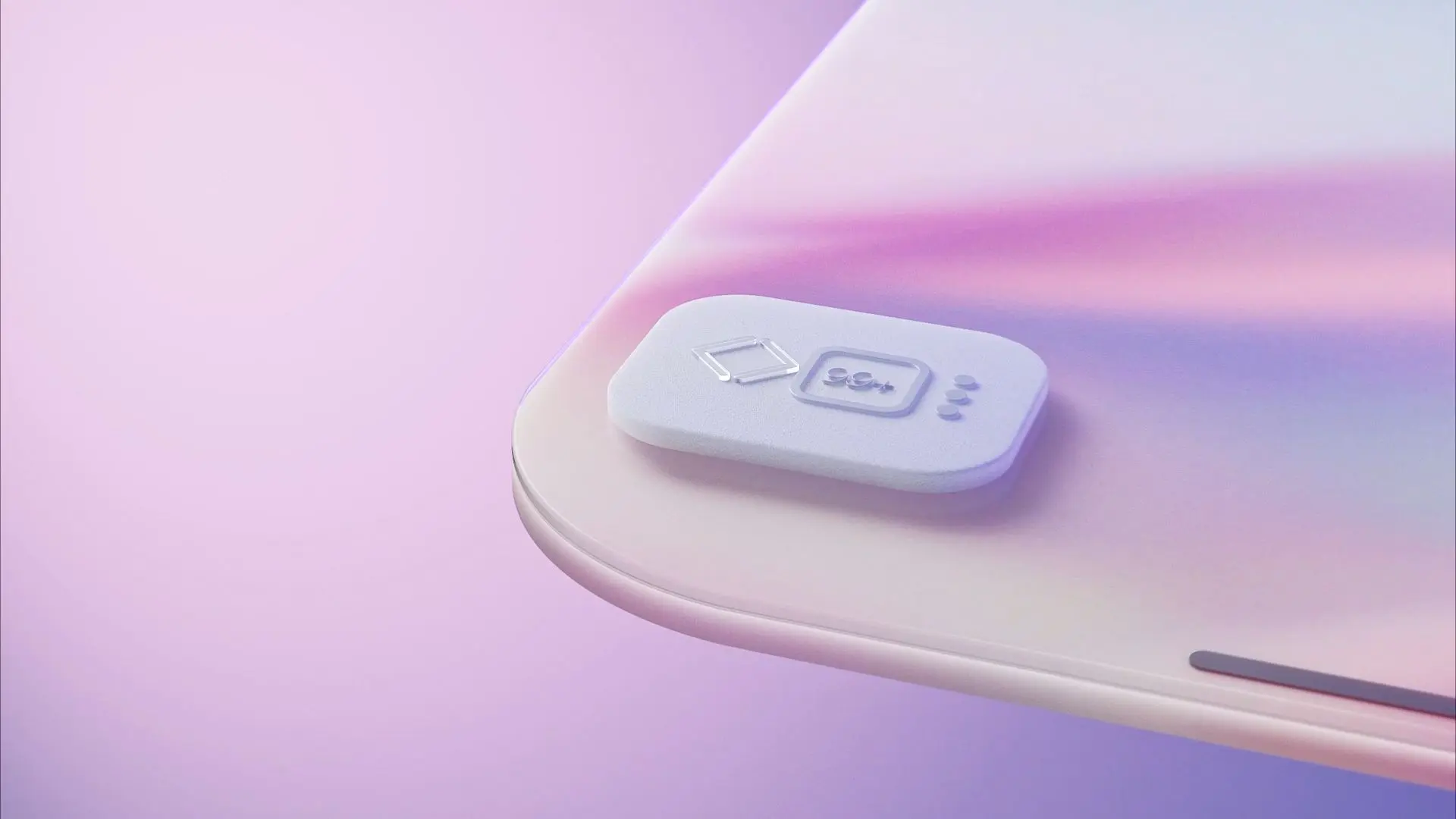
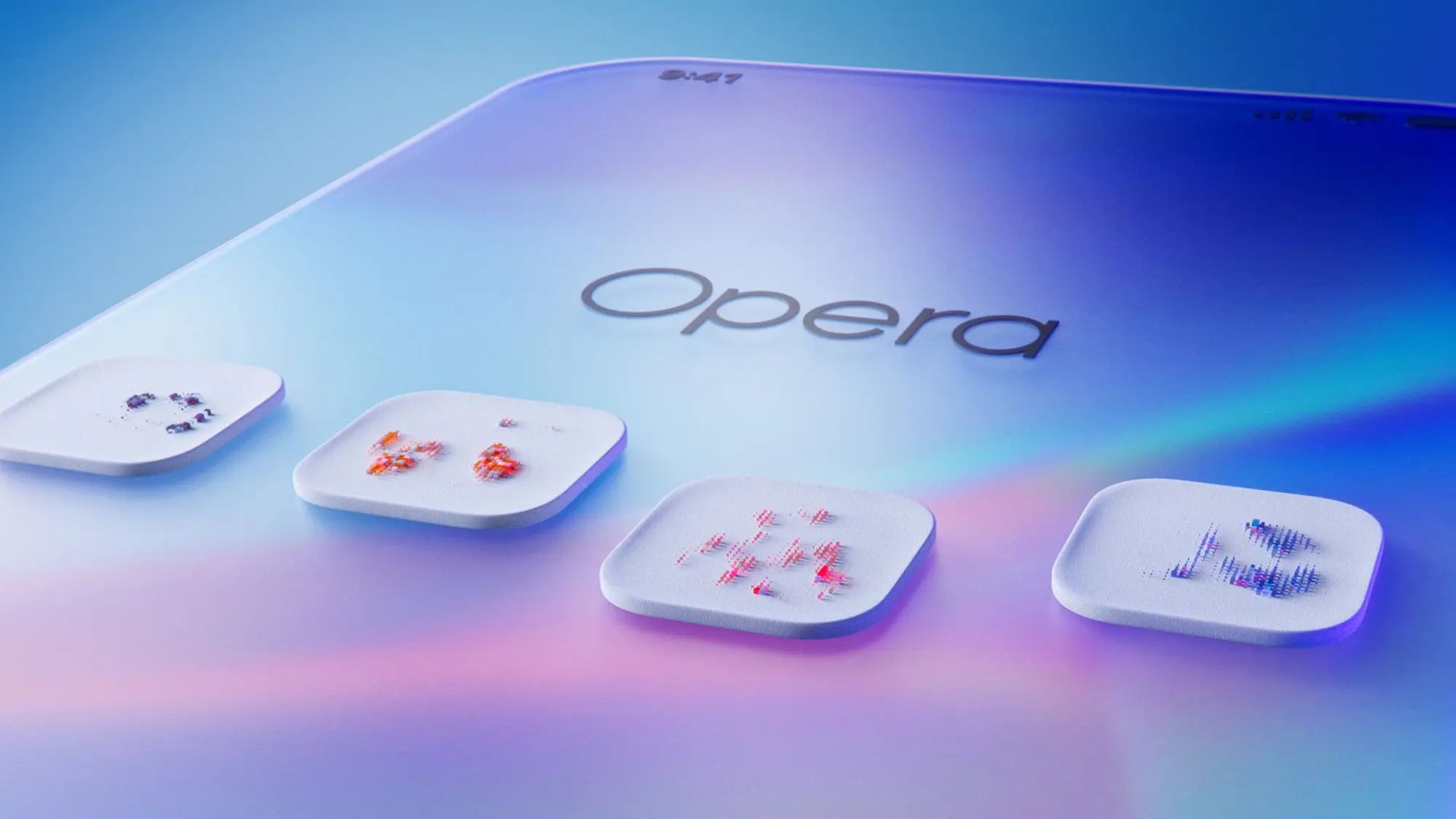
Opera

Opera for iOS

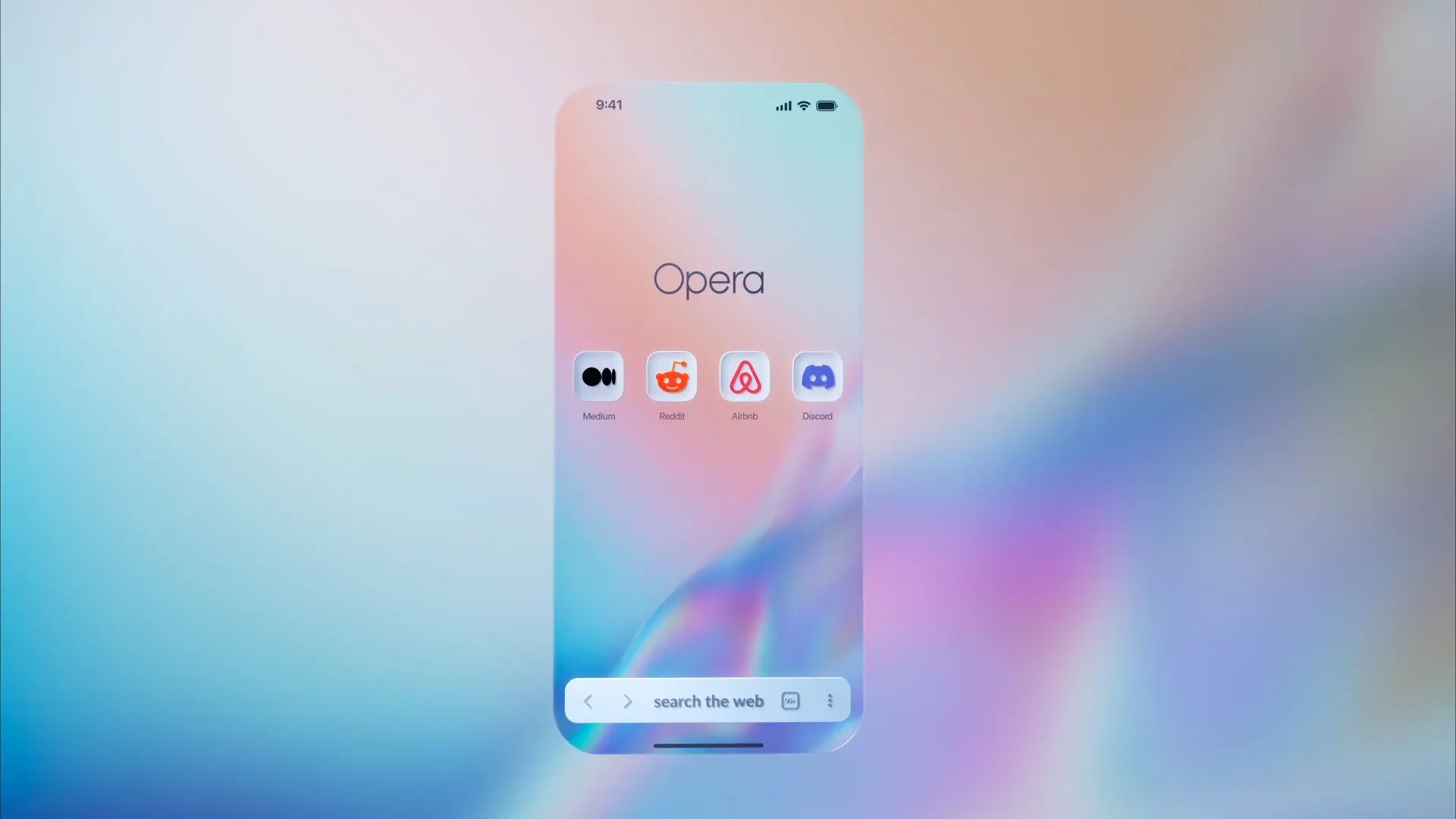
Opera was introducing a new set of features designed to make browsing on iOS feel faster and more intuitive. Search moved to the bottom of the screen, Speed Dial remained within easy reach, and gesture controls made navigation feel more natural. I directed and art-directed the launch film, developing its concept, story, and visual language from the first frame to the last.

The film needed to introduce three practical interface improvements without becoming a conventional product demonstration. It also had to reveal the advanced technology behind the browser while keeping the experience clear, immediate, and centered on the user.
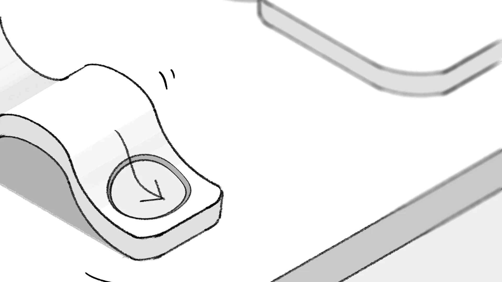
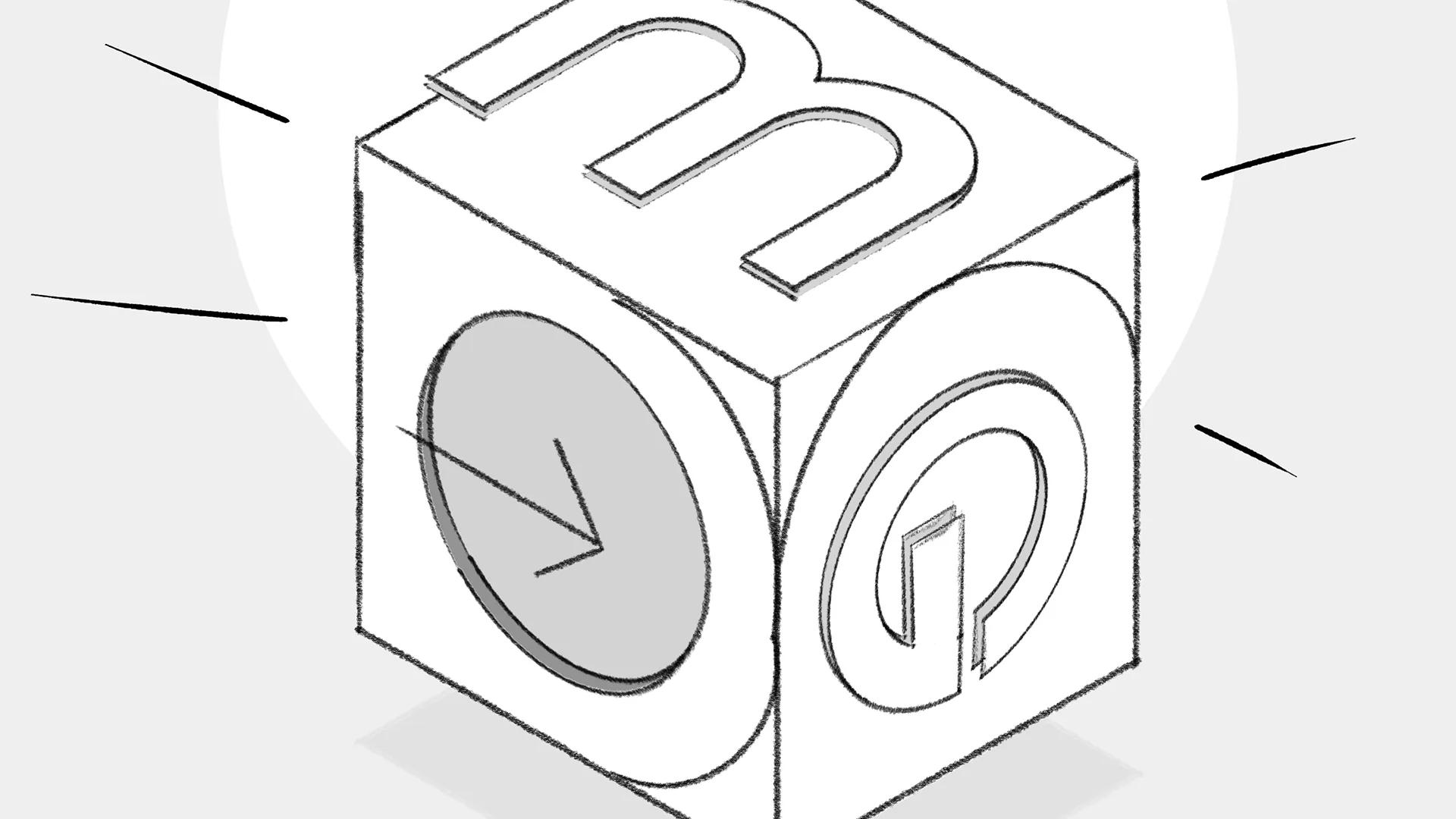
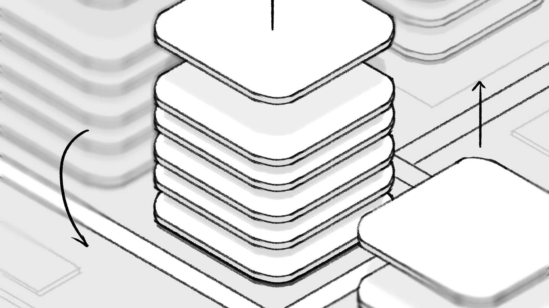
I built the story around two connected realities: the intuitive world experienced by the user and the complex modular engine operating beneath the interface. The phone screen became both a boundary and a portal between them, while light guided the viewer on a continuous journey.

From mission to visual narrative

Opera’s mission and Nordic roots became the starting point for the film.

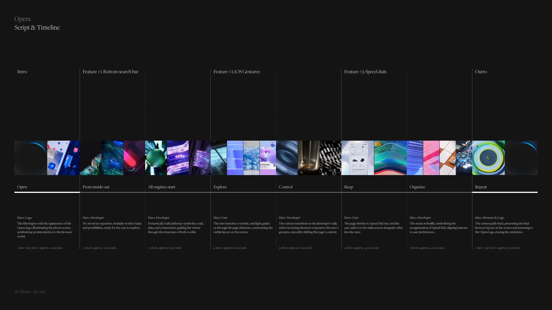
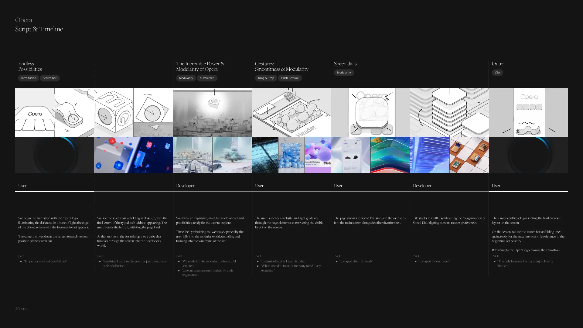
Ideas of light, space, simplicity and functionality were translated into a storyboard that connected human interaction with the technology behind it.

The story begins with the Opera logo emerging from darkness. Its light activates a vast modular engine, setting the browser and the film itself in motion.

Born from the land of light and space, from simplicity and functionality, where nature meets technology.

One interface, two worlds

Above the screen, every interaction feels simple and immediate.

Beneath it, a modular world of code, data and connections constantly reorganises itself to make that experience possible.

Moving between these two realities allowed the film to present each feature from both perspectives: what the user does and what the browser makes possible.

Building the journey

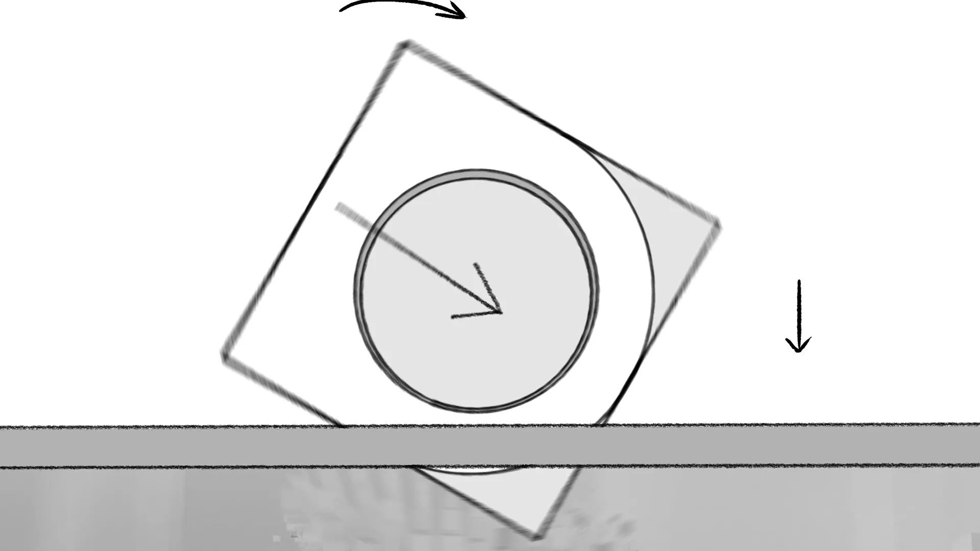
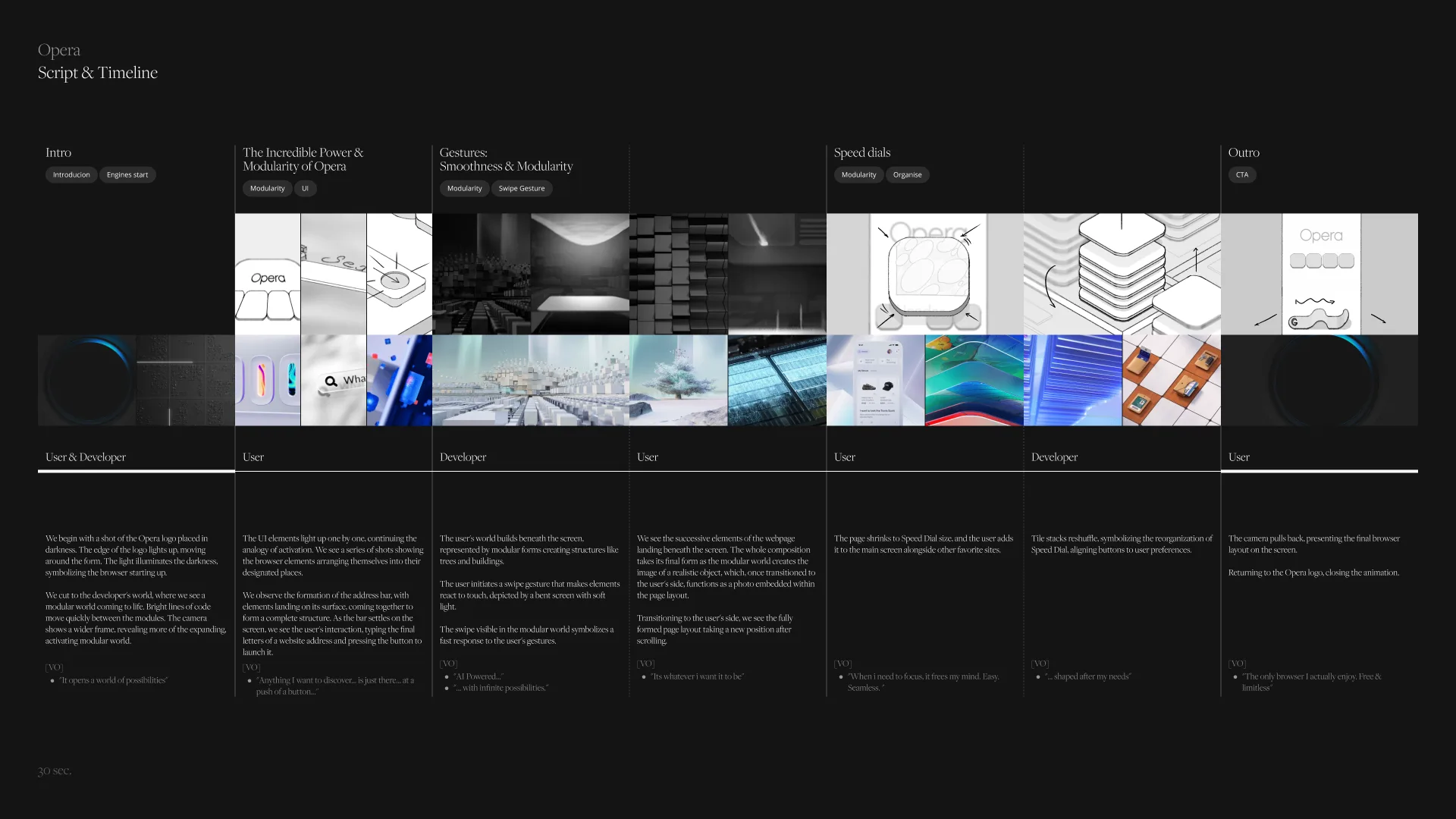
Previz was used to shape the camera movement, timing and transitions across the full 30-second story.

Each sequence had to grow naturally from the previous one, allowing the film to move between interface, landscape and modular architecture without breaking its rhythm.

Look development then defined the scale, materials, colour and light that distinguished both worlds while

Technology shaped around the user

The browser’s features became actions within the world.

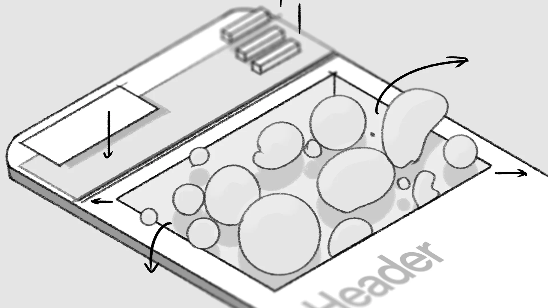
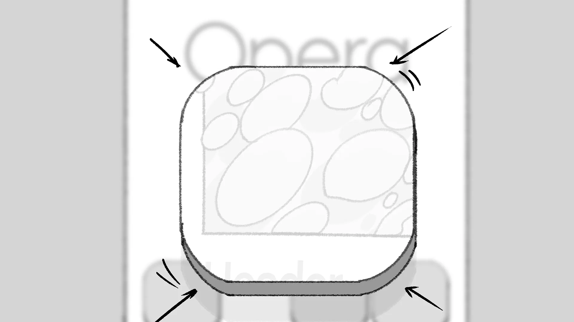
The search field assembled near the bottom of the screen, placing it naturally within thumb’s reach. A swipe gesture reshaped the modular environment beneath the interface. Web content then transformed into Speed Dial tiles, which reorganised themselves around the user’s preferences.

Rather than presenting separate demonstrations, every feature became another chapter in the same visual journey.

From the first frame to the last

I created the concept, directed the film, and led its complete art direction, defining the narrative, compositions, transitions, and visual language. The 3D and animation team developed the final sequences within this framework, carrying one connected idea from the earliest sketches to the finished film.

A launch story built for every screen

The finished film and campaign stills introduced Opera’s new iOS features across multiple channels, including YouTube and Opera’s developer platform. The result connected product functionality with a distinctive visual story about everything happening above and beneath the screen.